This is the story of a graphic design challenge and my path to solving it. It’s a story about all the meandering little steps that one takes on the journey from a design concept to a finished product. The challenge was to express the meaning of the word edit in a picture, using any medium at hand (photography, pencil sketch, vector art). This was my first sketch:
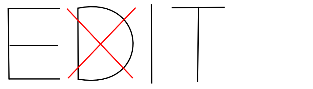
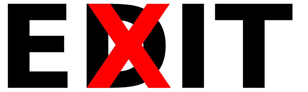
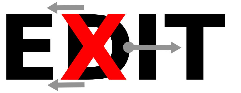
As you can see, I chose to include the actual word edit in the illustration (although that wasn’t required), and my idea was to give the word a taste of its own medicine: to show edit being edited. Once I had crossed out the d, I noticed that my red editorial mark gave rise to a second word: exit. This is where my obsession began.
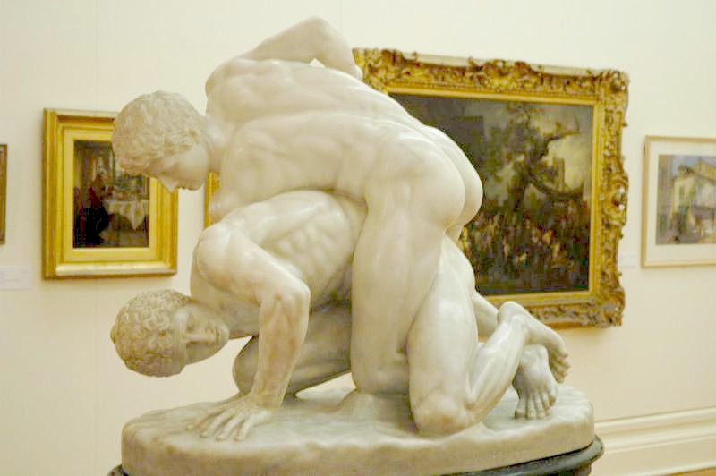
Could I take my sketch and turn it into a really dramatic composition, where the words edit and exit would appear to be struggling against each other, competing for prominence in an undecided typographic battle? I wanted it to be violent but beautiful, something like… I don’t know… The Uffizi Wrestlers?
Background: Pictorial Matter
I should tell you how I came upon this challenge. The story starts in late 2009, when a site called WordIt announced it would close.
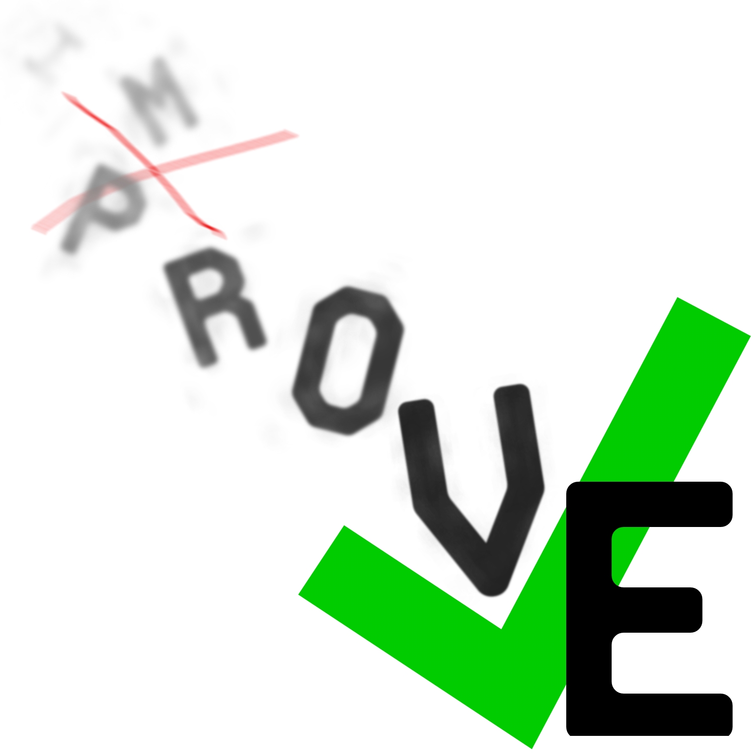
In six years of operation, WordIt had presented 76 words–one each month–and contributors illustrated each selection, offering dozens of visual interpretations of the same word. The site was a celebration of creative variety. This was my first submission to WordIt, from December 2009, when the word was improve and indeed, I felt I could improve by participating:
When I heard WordIt would be closing shop with one final illustration challenge–The End--I asked the founders if I could help keep it alive. I had been looking for a way to practice my design skills and WordIt seemed like the perfect forum. Now it would be going away just two months after I had discovered it? The founders insisted that their decision to close WordIt was final, but they wished me good luck in starting my own venture based on the idea. So I pondered over a name, created a logo, and wrote to my friends announcing the launch of Pictorial Matter:

For ten months, I posted new words and tried to rebuild the forum that WordIt had been. This was our motto:

Although Pictorial Matter never took off, the effort left me with some fun souvenirs for show and tell, including my design for edit, which was Pictorial Matter’s word in September of 2010. My search for the ideal edit led me deeper into the subtleties of typography than I’d ever looked before. It’s easy to cross out a letter, as in my sketch above, but to do it in a way that satisfies the aims I had in mind—drama, counterpoint, proportion—leads into some deep questions about design and visual perception, questions which I hope this story will provoke you to explore further.
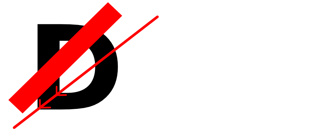
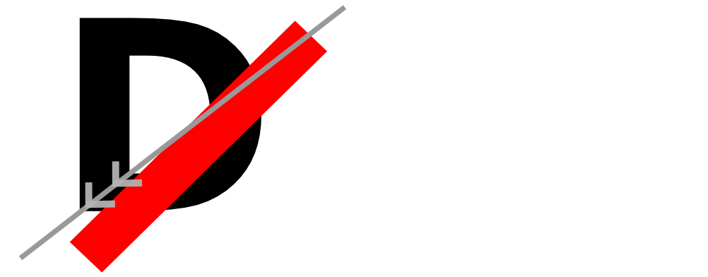
As a side note, my original title for this story was The Defacement of a D. I changed it when I realized my goal had not been to “deface” the d in edit, but to show the letters, and the corresponding words, in a wrestling match. Now to the nitty-gritty of staging that match.
Basis: A Typeface for EDIT
The first problem was to choose a typeface for edit. I wanted the most stable look I could find. Here are some options I considered:
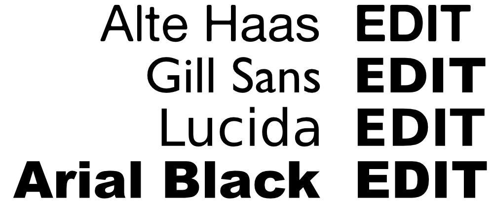
How to select between them? In the capitalized word EDIT, the E and D seem to stand as pair visually, contrasting with the I and T pair. So I looked at the relationship between E and D in each typeface, searching for the best balance.
I thought Alte Haas Grotesque had a beautiful E/D balance but the face was smoother than what I wanted, and seemed to have too much personality of its own:

In Arial Black, the E drew my eye’s attention and seemed to dominate over the D:

In Gill Sans, the D seemed more prominent than the E:

Lucida struck me as the best option—not beautiful like Alte Haas, but appropriately neutral:

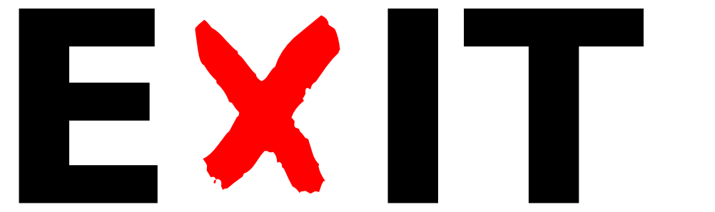
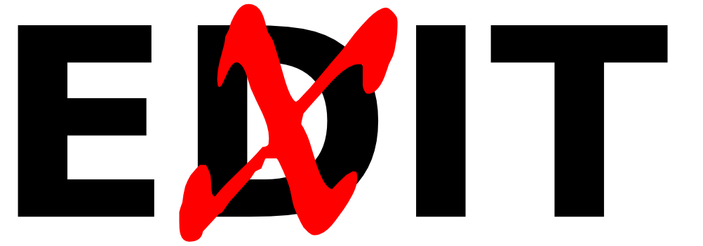
Here’s the full image that I took as my basis, rendered in Lucida:

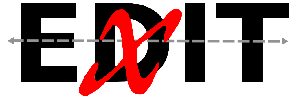
First Experiment: Positioning the X
Next came the fun part, choosing and positioning the X. I started with the obvious approach, using the X from Lucida Sans and placing it right over the D so the left corners lined up:
I noticed a small pocket of white between the outer right side of the X and the inner right side of the D:
Was that pocket a flaw? To me it looked annoying: big enough to get my attention but small enough that I felt the urge to fill it in, make it go away. I didn’t want to “cheat” by modifying the type (this was an implicit design constraint that I realized I had adopted–to solve the problem with existing typefaces with no alterations), so I got rid of the pocket by shifting the X right:

Now the left corners of D and X didn’t line up, but this alone didn’t break the deal. What bothered me was that my eye seemed to gravitate towards the center-right point of the X and I started to see a K shape there which didn’t belong:
So, although the small pocket had seemed like a flaw, it had also reinforced the X as an X and prevented the K image from entering the scene. I wasn’t ready to return to the pocketed version though, so I tried shifting the X left:
Now my eye was drawn to the leftmost top and bottom corners of the X. The X itself seemed to be sliding left while the D was moving right:
I felt I needed to keep exploring.
Second Experiment: Using a Brush
I thought it would be fun to try a handwritten X with a brush look (this one is from j. d.):
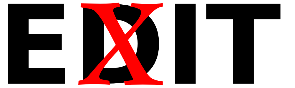
At that size, the X seemed to obliterate the D. I could still tell there was a D back there but the X seemed the clear winner, and I wanted the battle to remain undecided. One thing I did like was how the word EXIT popped out:
Could I preserve the ease of reading EXIT while making EDIT more prominent? When I tried making the X smaller, EDIT came back into view, but EXIT became harder to see:

To check my judgment I took the D out and tried to read what was left:
My eye wanted to read this as “E x IT”, a mathematical formula with the X as a multiplication sign:
I also found the image a bit choppy, with the X/D combination standing on its own, not really interacting with the other letters:
Digression: The Dynamics of “Crossing Out”
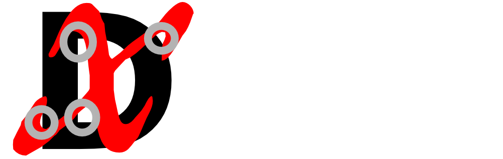
Having tried a bunch of things without finding an option I loved, I wanted to gain a deeper understanding of the problem. I had been seeing how very small differences in the size and position of the X could greatly change the overall effect of the composition. Ultimately, I would need to cover up part of the D while leaving the critical parts in view so that its essence, its “D-ness” would still come through. But what were those critical parts? What really makes a D a D? To start with, which of the D’s four corners are most important to its identity?

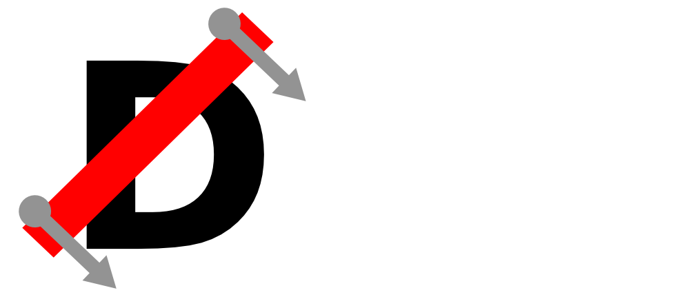
I thought I could learn more about D by covering it, not with a full X, but just a single diagonal bar in various positions. With the bar covering up certain details, would the D still look like a D, and how much interference or distortion would there be? I started by placing the bar here:

That initial configuration seemed busy because the bottom corners of the D implied a second line, clashing with the red bar. When I tried drawing in the line, my eye relaxed:
In this arrangement, the red bar also looked unstable, as if it were poised to fall or slide further down the D:
 What would happen if I moved the bar in the direction it “wanted” to go? I let it slide down so it just touched the outer bottom corner of the D:

Now I couldn’t see the actual corner of the D, and there was a sense that its bottom could be extending leftward:
 I moved the bar down further so that it was fully covering the outer bottom corner of the D and just touching the inner bottom corner:

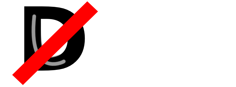
I saw an illusion where the white space seemed to be cutting into the D, right where the red bar met its bottom inner corner. This example is doctored to show how it appeared to me:

In fact nothing had been cut: 
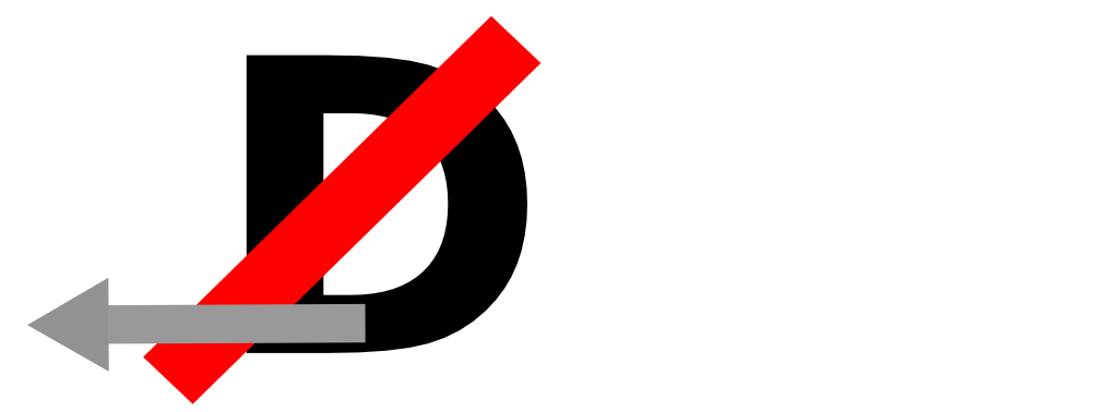
Now I moved the bar down further so it covered both the inner and outer bottom corners of the D:

In this configuration the bottom of the D seemed to be widening:
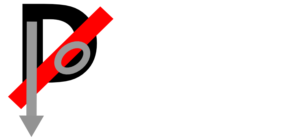
I moved the bar down further so that it its top edge just touched the bottom outer corner:

Here the D seemed to be morphing into a P, and developing a belly:
I moved the bar down so the bottom right outer corner was exposed. Now the D was clearly a D again, no longer morphing into a P:

Finally I moved the bar so both corners were exposed. Again the image seemed busy, with a line implied by the corners:

And again, my eye seemed to “feel better” when I drew in the implied line:
This excursion didn’t lead me to a solution, but it gave me experience with the subtleties the challenge, experience that almost certainly figured into the choices I made later. I didn’t emerge with a clear conclusion or a Theory of D-ness, but I knew I hadn’t wasted my time.
Third Experiment: A Journey into Serifs
I returned to the main problem and tried something new, rendering the X in an old style serif typeface. The X from Centaur looked like this:
The serifs called my attention to the horizontal lines at the tops and bottoms of the letters:
It wasn’t quite the look I wanted, so I tried switching to Centaur’s italic X:
I liked the diagonal sweep of the X, which seemed to connect the E with the I and create a sense of flow in the whole image:
Why didn’t I choose this version? Well, the Centaur Italic X looked too jolly to me, as if were dancing with the D, not wrestling–still not the right look.
Fourth Experiment: A Treasure Trove of Italics
I searched for something with the flowing aspects of Centaur but with more aggression. OFL Sorts Mill Goudy fit nicely over the D, but looked limp:
Palatino looked a bit busy with its calligraphic stroke tips:

Hoefler’s Requiem seemed a beautiful fit, but again too graceful, too happy:

And I didn’t get far at all with Didot:
 I was starting to question the sanity of my goals when I found this X from the Great Primer face in the IM Fell family. A ray of promise. The rough edges looked like they’d make a nice contrast with clean lines of Lucida, and the x shape seemed to have more aggression in it:
This is what happened when I put it over the D:
More problems! There were two small gaps outside the D and two nearly missed corners inside the D:
I knew the fit would look smoother if I could eliminate those gaps and either cover or cleanly intersect the inner corners of the D. Would that be possible with this particular X shape? Yes, but to make it work I had to move the X down too low:
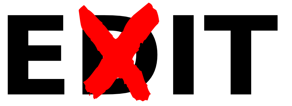
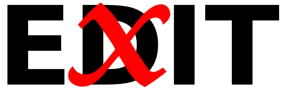
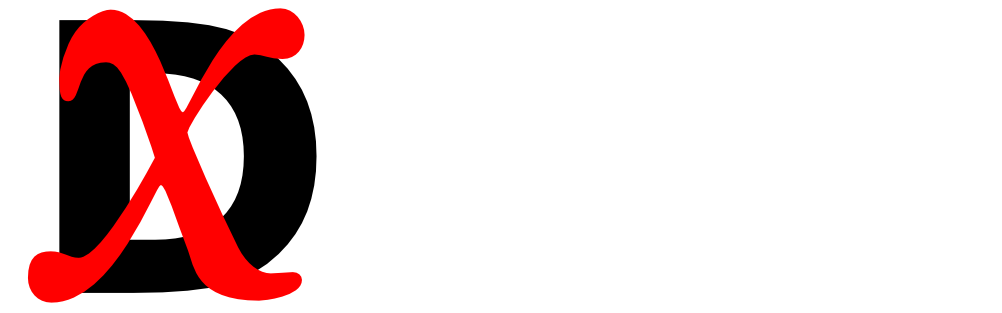
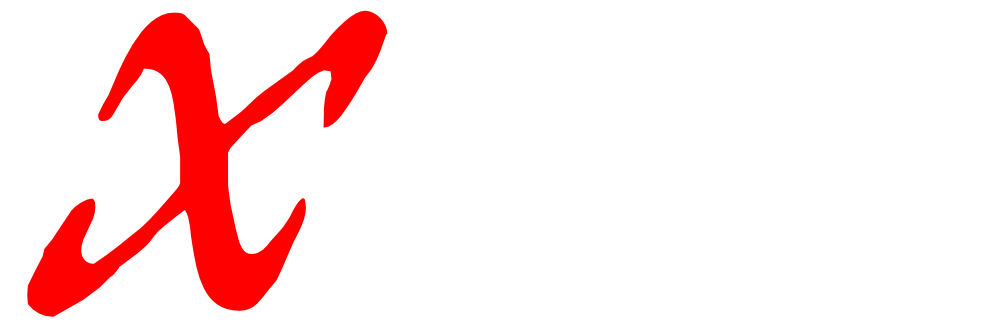
 At my wit’s end, I tried one last thing, an X from Double Pica, also in the IM Fell family. Similar rough edges and an even more violent appearance:

This was my initial placement:

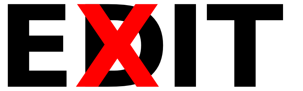
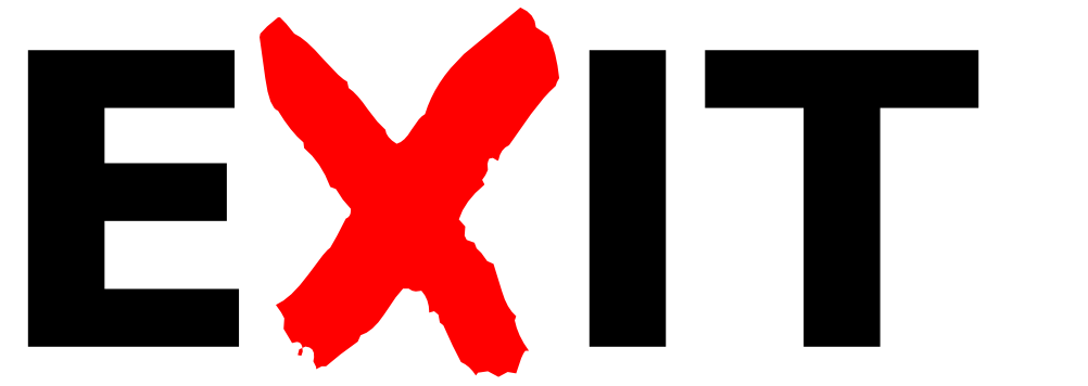
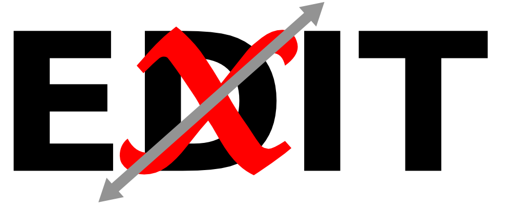
I adjusted the positioning and bingo, the X snapped into place:
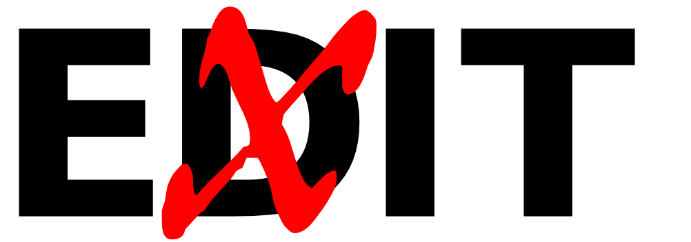
Had I found what I’d been searching for? I kept staring at it. Yes, I felt there was some real violence in the image, but also a sense of flow, with the X nicely connecting the E and the I. The X seemed a clear outlier, contrasting against the D and other letters, but at the same time joining with them to form a legible EXIT. The D looked to be under attack, but holding its own ground, remaining recognizable as a D and participating in a still-legible EDIT. The visual style had turned out very different from The Uffizi Wrestlers, but my goal never been to mimic the look of that sculpture, only to find a similar blend of aggression and beauty. I was ready to call this a victory.
Finishing Touches
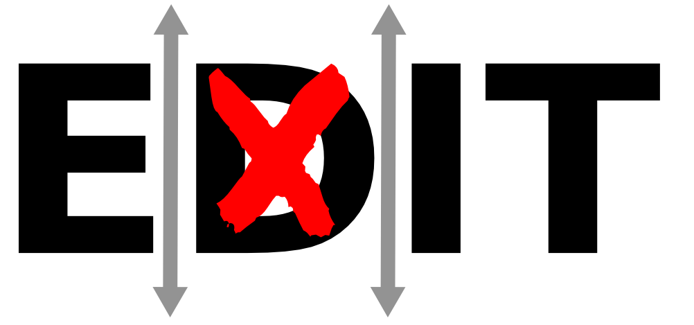
Now it was time for the finishing touches. First I looked at the space between the endpoints of the X and the neighboring letters:

I tightened things up a bit:
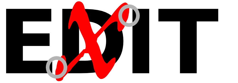
This was my kerned image without the markup:
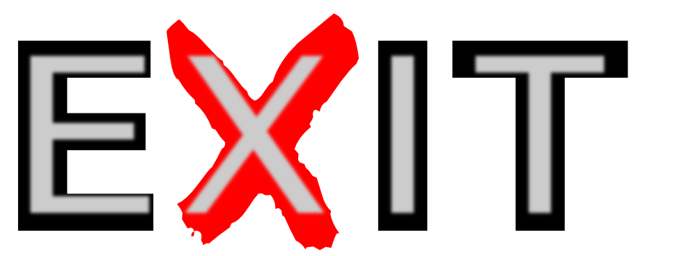
Next I considered my background options, starting with light gray:
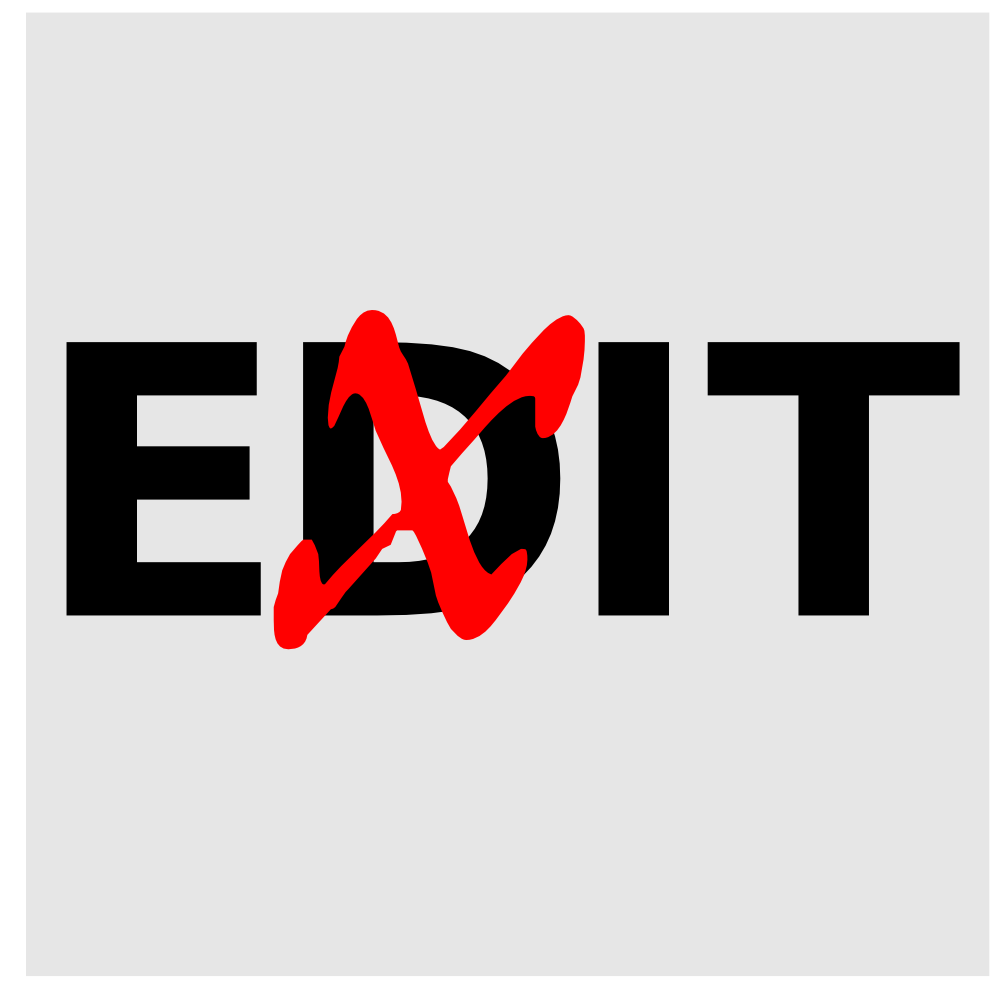
I liked the light gray background much better than plain white. Since the contrast between the black EDIT letters and the background was now reduced, the red/black contrast seemed to come forward more. Would a still darker background make it even more dramatic?

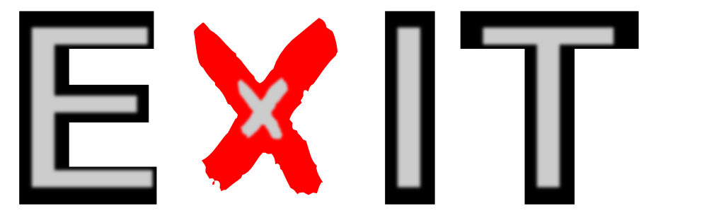
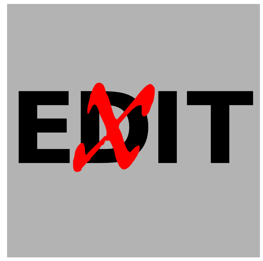
This version seemed too dark. Now the EDIT letters were starting to fade into the background and the red was popping out by itself. This was one of those cases where the “middle path” turned out best. Here’s my final design, with medium gray:
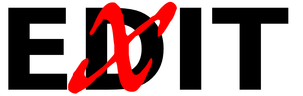
And this is what that wonderful x from IM Fell’s Double Pica looks like in a more conventional application:
 ■
■