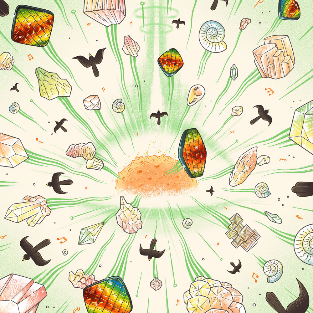
This image shows a meteorite impact sending gems and birds flying in all directions. It’s the new cover for my album Meteorite. It was created by the fantastic illustrator Jon Wilcox and we finalized it Monday, Jan. 2, 2023 after a month of development.
Here are all the things that had to come together to make this image what it is:
-
It had to show a meteorite impact in a way that seemed positive – suggesting creativity and potential – without evoking destruction or appearing like a nuclear disaster. Why a meteorite impact? That’s because the largest piece in the album is titled Meteorite and I think of the track list as a kind of explosion outward from that huge, central, and somewhat disorienting piece.
-
It had to show birds flying away from the scene. Why birds? That’s because the second large piece in the album is titled Birdsong and it’s based on my listening to lots and lots of bird calls.
-
It had to feature the rainbow-colored fossil Ammolite prominently. Why Ammolite? That’s because the third large piece in the album is titled Ammolite and I think of that piece as a kind of “rainbow” of experiences and scenes.
-
It had to include a variety of other gemstones and minerals with different shapes and textures. Why gems and minerals? That’s because I use a gem and mineral naming scheme for all my canons. Topaz, Amber, Garnet…
-
It had to depict the meteorite itself in a way that couldn’t easily be confused with other things (sun? giant meatball?) which is challenging given that we’re used to seeing meteorites as flying objects but, if you think of it, there isn’t really a common, widely accepted visual stereotype of how a meteorite is supposed to look as a rock.
-
The overall color scheme had to be reserved enough that the Ammolite colors could really stand out.
-
It had to include musical notes, suggesting that this is a musical event.
-
It had to have a strong sense of depth and expansive motion.
-
It had to have an element of surreality while still being legible.
-
It had to embody the idea of “ordered chaos” and neither be too busy nor too plain.
It took a lot of steps to get to this final product. But through Jon’s amazing work – this whimsical set of ideas and requirements for an image has become a real, living design that I just want to look at every day. It’s such an exciting feeling to now be able to share it with you, dear viewer. ■