I’ve been searching for art to use as an album cover for the set of canons that I’ve been working on since 2014, now performed beautifully by Matthew McConnell on harpsichord. The images I’ve considered so far reveal a lot about the album itself, so I’d like to share this story of the hunt that’s now lasted five days.
In a musical canon, there’s one part that leads and another that follows. This second part is a copy, image, reflection, or translation of the first part. One visual theme this brings to mind is the idea of an object and its shadow… preferably a curved or wavy object that evokes the ups and downs of a flowing melodic line. Indeed, when I first began my canon project, I made a cover using my own photograph of a curvy bike rack and its shadow. This is an image I captured back when I first began exploring photography with an iPhone 3GS and it’s one of my favorites from that time:
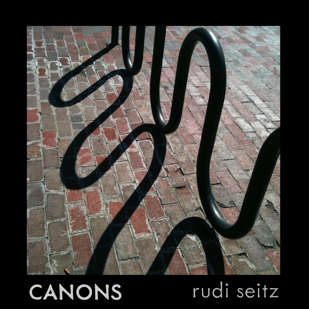
I continue to use this cover for the collection of computer-generated recordings of my canons that I maintain on Bandcamp. I love the cover and have received many compliments on it, but since it’s already in use I need to find a different image for the new album of Matt’s harpsichord performances.
As I searched around on the theme of shadows, I came across these vintage diagrams showing how to make hand shadow puppets. They were amusing to find – I admire their variety and intricacy! – but they’re not quite what I’m after…
[gallery ids=“3450,3453” type=“rectangular”]
Moving on from the shadow concept, mirrors and reflections are another visual theme that resonates with canons. Here are two intriguing mirror illustrations I found in a nineteenth century science text, El mundo fisico gravedad, gravitación, luz, calor, electricidad, magnetismo, etc. by A. Guillemin:
[gallery ids=“3228,3229” type=“rectangular”]
I really like these images, but I don’t love them enough to use on the album cover. I’ve always enjoyed the way vintage scientific engravings seem to straddle the line between art and merely functional illustration. These images strike me as falling somewhere in that happy region, but lacking the magic that would make me return to them again and again.
A friend asked me why I’m spending so much time obsessing over the album cover when most people will care more about the music itself than the cover – wouldn’t any decent cover suffice? My first answer was that I’m doing this for myself: if I am going to be looking at the cover for years to come, it’s got to be something I really love. My second answer is that I’m still committed – rationally or not – to the idea of an album as an integrated whole, including cover art, liner notes, and audio, so… every choice is important.
Continuing with the theme of mirrors and reflections, art history includes a multitude of portraits involving mirrors. Here’s a depiction of the painter Iaia of Cyzicus (“Marcia”) working on her self-portrait using a mirror. It’s from an illustrated French translation of De Mulieribus Claris, known as the earliest collection in Western literature dedicated to biographies of women:
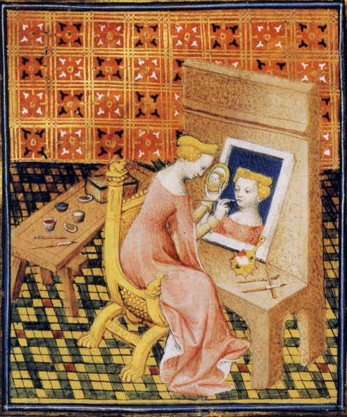
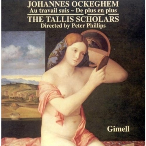
Again, I really like it (the three images of the painter’s head, the depiction of art in the making, replete with the painter’s tools, the tiled floor and patterned background), but I don’t love it in the way that would make me choose it as a cover. Another mirror portrait that comes to mind is by Renaissance painter Giovanni Bellini, but the Tallis Scholars already used it on the cover of their Ockeghem album which I’ve listed to a lot:
One portrait involving a mirror that I do love is En nøgen kvinde sætter sit hår foran et spejl (I can’t pronounce that, but I can cut and paste!) by Danish “Golden Age” painter C. W. Eckersberg. I’m so fond of the painting that I added text and made it into a real candidate album cover, thinking for some time that it was “the one”:
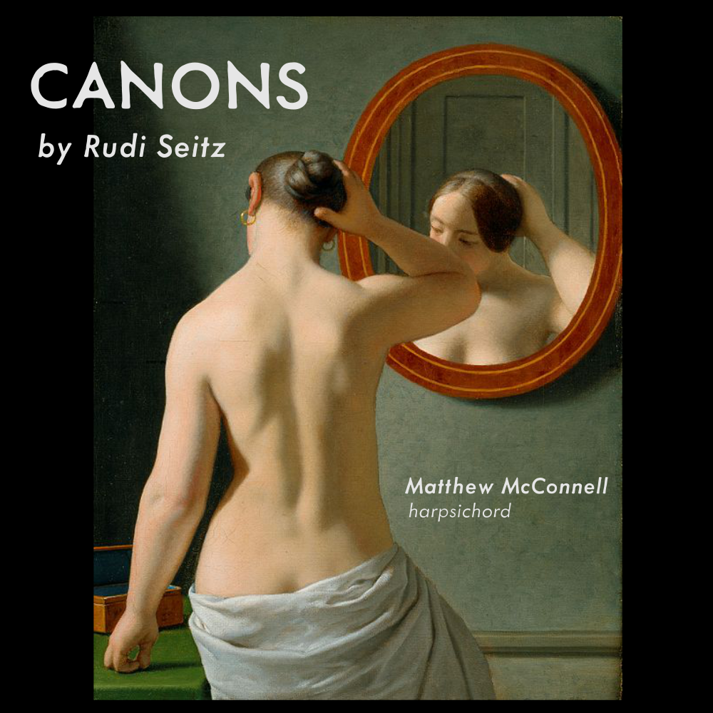
In addition to its use of the mirror, and its overall elegance, I like this image for the canon album because it has the sense of timelessness – rather, that sense of being old and new at once – that I’ve been seeking in the musical compositions themselves: each canon looks back to principles of traditional counterpoint from the Renaissance and Baroque while at the same time exploring modern possibilities. The painterly technique as well as a few details (the subject’s hair style?) tell us that this work is from an earlier time, but when specifically? The image is spare and simple enough it does not seem dated – we could almost be looking at a contemporary scene rendered by an artist conversant with traditional techniques.
This option seems to have the “classical album cover look” and I love it, so why not use it?
The painting just doesn’t feel like a perfect fit for the music. It’s an intimate scene that makes the viewer feel he or she is almost intruding, and that’s not how the canons make me feel – they don’t create the sense of witnessing a “private moment.” The Eckersberg is a sensuous image, and while I like that in some ways – first, it would be attention-grabbing as an album cover, second it insinuates that the accompanying music is beautiful and compelling – it doesn’t capture an important aspect of the compositions: their mathematical nature, the way they are carefully crafted structures, born of calculation and artifice. We can’t know what the woman in the painting is thinking, but if she’s fixing her hair in front of a mirror we could guess that she’s considering her appearance, and perhaps thinking of who she will see later in the day, and how they will see her: the image conjures the personal, the world of human concerns and relationships, but yet the canons seem more abstract than that. I’d love to use Eckersberg’s painting on a cover someday – for a different album!
Turning away from such a promising option, what else is out there? Here’s a thought: the bike rack in my original album cover looks something like a snake. A snake is evocative of a musical canon in the way it makes beautiful patterns by folding on top of itself, or in the way the motions of two snakes – or even different sections of the same snake – seem to copy or imitate each other. Here are my favorite snake illustrations:
[gallery ids=“3249,3248” type=“rectangular”]
My concern here is that many people – rightly or wrongly – view snakes as menacing, and I want the album cover to be inviting. In deference to the ophidiophobes among us, I decided to look further.
All of the canons in the album are named after gemstones or minerals: “amethyst,” “malachite,” “obsidian,” “silver,” and so on. This is a naming convention I adopted to impose some uniformity on the collection and also to keep myself from getting stuck trying to find the perfect descriptive name for each piece – an endless and in some cases impossible task. Given the way the pieces are named, one possibility is to use an illustration of gemstones as the cover, preferably a print from a vintage science text:
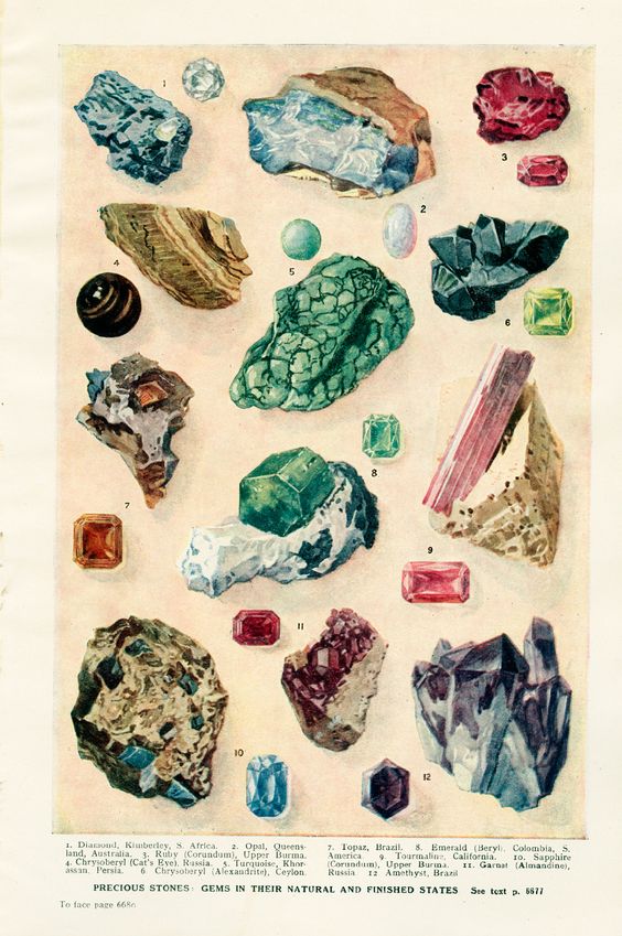
What I like about this option – an image showing a dozen or so different stones – is that it evokes the variety of the album: each canon is in its own mood and compositional style, and while there are similarities and some common themes, the pieces are not tightly connected – they each stand on their own. And when you have 45 independent, miniature creations all together, they make a kind of miscellany, sort of like a collection of beautiful stones of all different colors, textures, and shapes as shown in this image. In listening to the album as I prepare the release, my one concern has been that listeners might find it to be something of a hodgepodge, with many pieces clamoring for attention but not flowing logically from one to the next since they were not written with that aim in mind. I like the way these gemstone illustrations actually set the expectation of an assortment – a beautiful, intriguing collection that’s fun to explore and that makes no promise of tight integration.
On the other hand, I worry that gemstones don’t have an obvious connection to canons other than the fact that I’ve happened to use them as canon names. Gemstones on the album cover might be a bit perplexing until the viewer – if he or she persists – comes to understand the finer details of the album.
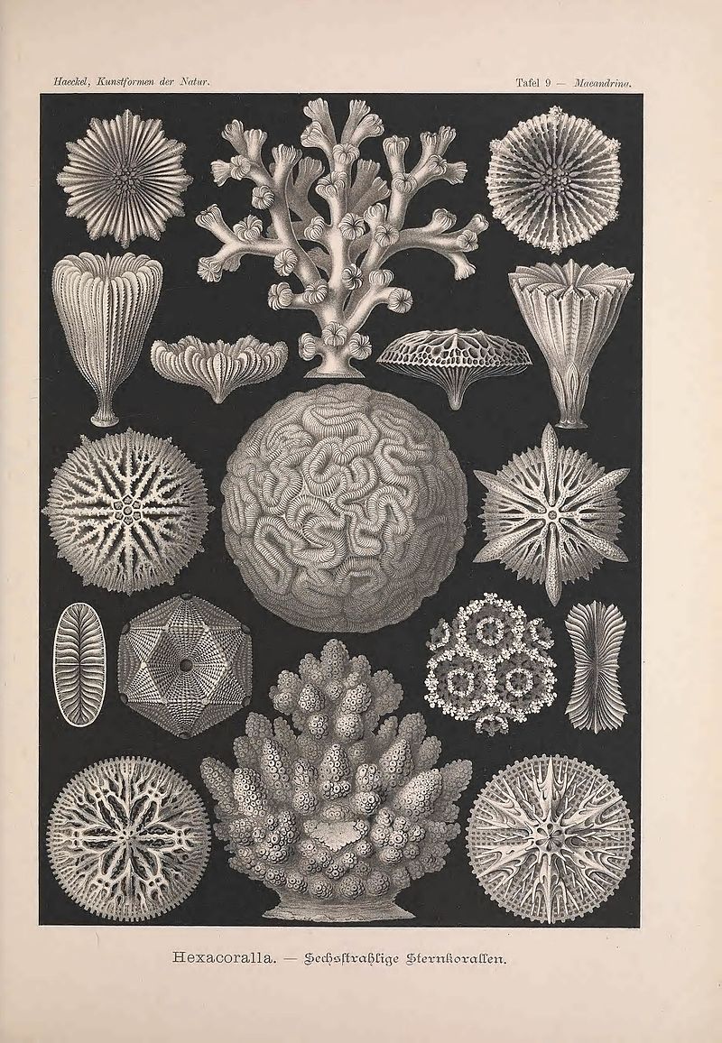
In searching for other old science illustrations I was delighted to come across Haeckel’s Kunstformen der Natur – which reminds me of one of the joys of my childhood: looking through my grandfather’s old botany textbooks and the drawings he made when studying to be a botanist before he was drafted. Haeckel’s images are so entrancing that I’m not surprised some people adapt them as tattoos! Unfortunately I couldn’t find a Haeckel image that seemed right for the canon theme. Here’s one I love though:
Another theme I considered are geometric patterns like tilings, mosaics, and Escher-like tessellations:

But I don’t want something too regular and seemingly deterministic. The canons have patterns in them, but what makes them interesting is how patterns are broken or redefined: ultimately each canon tries to escape its mechanical, calculated nature and become something more.
Some of the canons are perception-bending, and I even wrote one piece (#11 “Hematite”) that is designed to imitate the effect of Penrose stairs where you think you’ve been ascending until you discover you’ve actually descended:
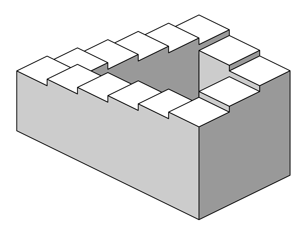
Using Penrose stairs or some other impossible object or illusion on the cover is a strong possibility but yet I don’t want to convey the sense that the album is all about perceptual trickery and/or disorientation.
Another possibility is to use an image of the harpsichord, but that doesn’t add as much from an interpretive standpoint as I’ve been hoping the cover art would add. Beyond the harpsichord, I could use a fantastic or imaginary musical instrument:
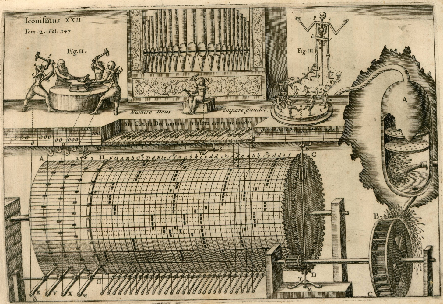
The above image is an automatic organ proposed by Athanasius Kircher in Musurgia Universalis. I’m intrigued by this speculative musical automaton but I worry that it would make a confusing album cover as there could be the implication that this instrument, or something like it, is actually used in the recording.
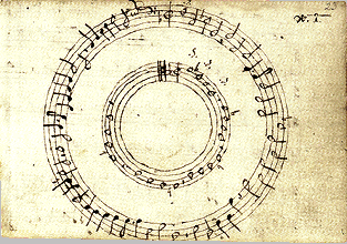
There’s also the possibility of using music notation on the cover, like the circular score of John Bull’s puzzle canon, Sphera Mundi:
Or the score of Baude Cordier’s canon Tout Par Compas from the Chantilly Manuscript, used on the back of a wonderful album by Ensemble PAN:
[gallery ids=“3457,3456” type=“rectangular”]
A solid prospect, but I’m reluctant to use another composer’s work on the cover as it could imply that this music is recorded on the album. Also, as I mentioned earlier, I’m hoping for an image which reveals some kind of interpretive perspective on the album – sheet music seems too straightforward from that standpoint (though the circular scores above are certainly intriguing). A friend suggested taking a photograph of one of my own scores, and possibly showing it reflected in a mirror – a great idea! – but I’m a perfectionist about my photography and I’m trying to get this album cover done without delay. I’d rather not embark on a photographic project unless I absolutely can’t find some existing art to use.
Turning back to the theme of mathematical constructs and searching through many old geometric illustrations, I was very excited to come across the fantastical creations of 16th century German artist Lorenz Stoer, published in Geometria et Perspectiva:
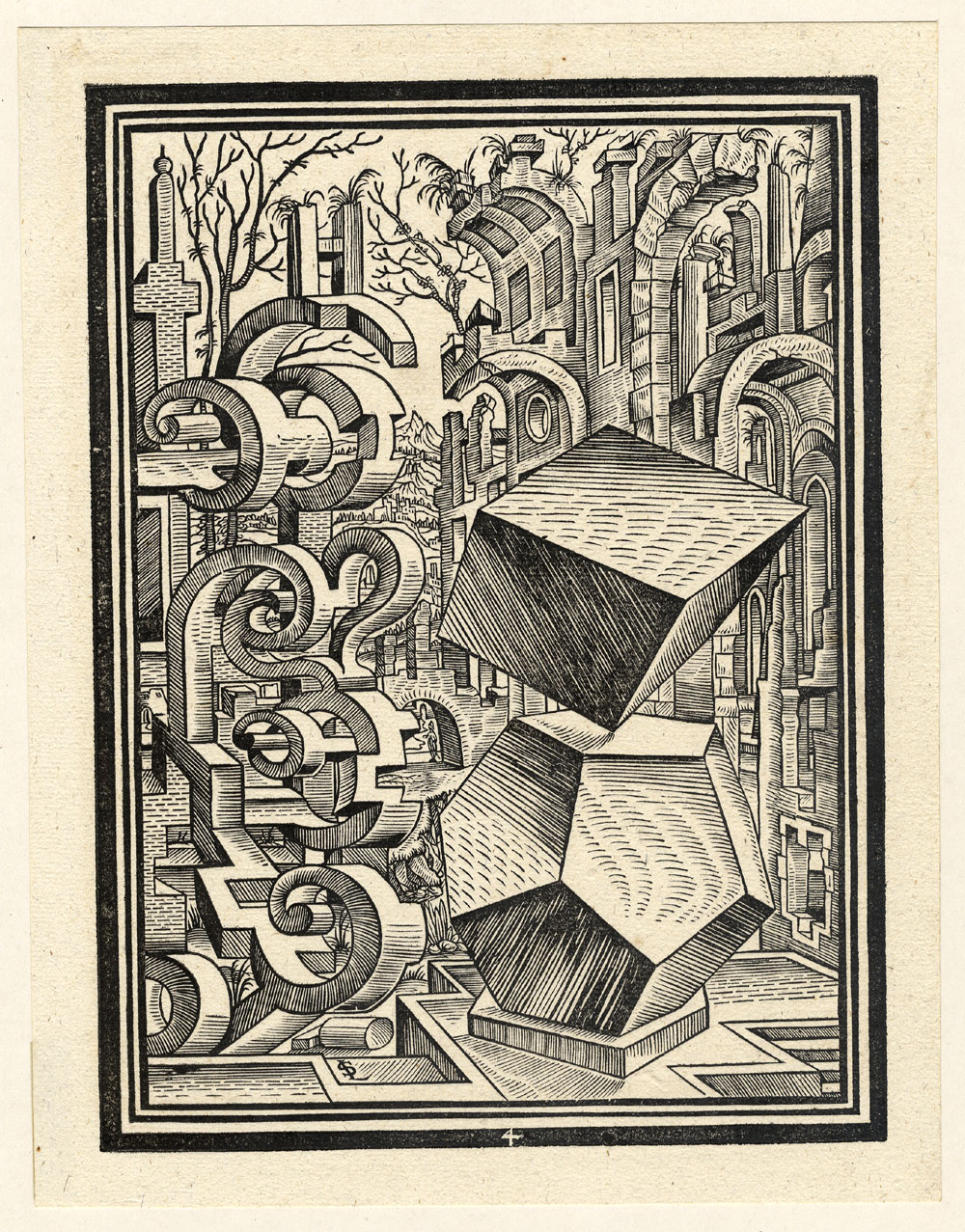
WTF? It’s a beautifully bizarre combination of perfect polyhedra in the foreground, with abstract curved structures that somewhat resemble the arches of ruined buildings in the background, beyond which we see trees, a village, mountains – where is this? What is this? I so want this to be my album cover, but alas, the aesthetic is not the right match. The image is too sprawling and seemingly chaotic to match the canons which I view as constrained and tightly constructed, even minimalist in that they’re very short and they only use only two voices.
Yes, I’m a tough customer, but my demands are not impossible to satisfy. When I came across the geometrical illustrations in Perspectiva Corporum Regularium (1568) by Wenzel Jamnitzer, I knew I might find my cover within:
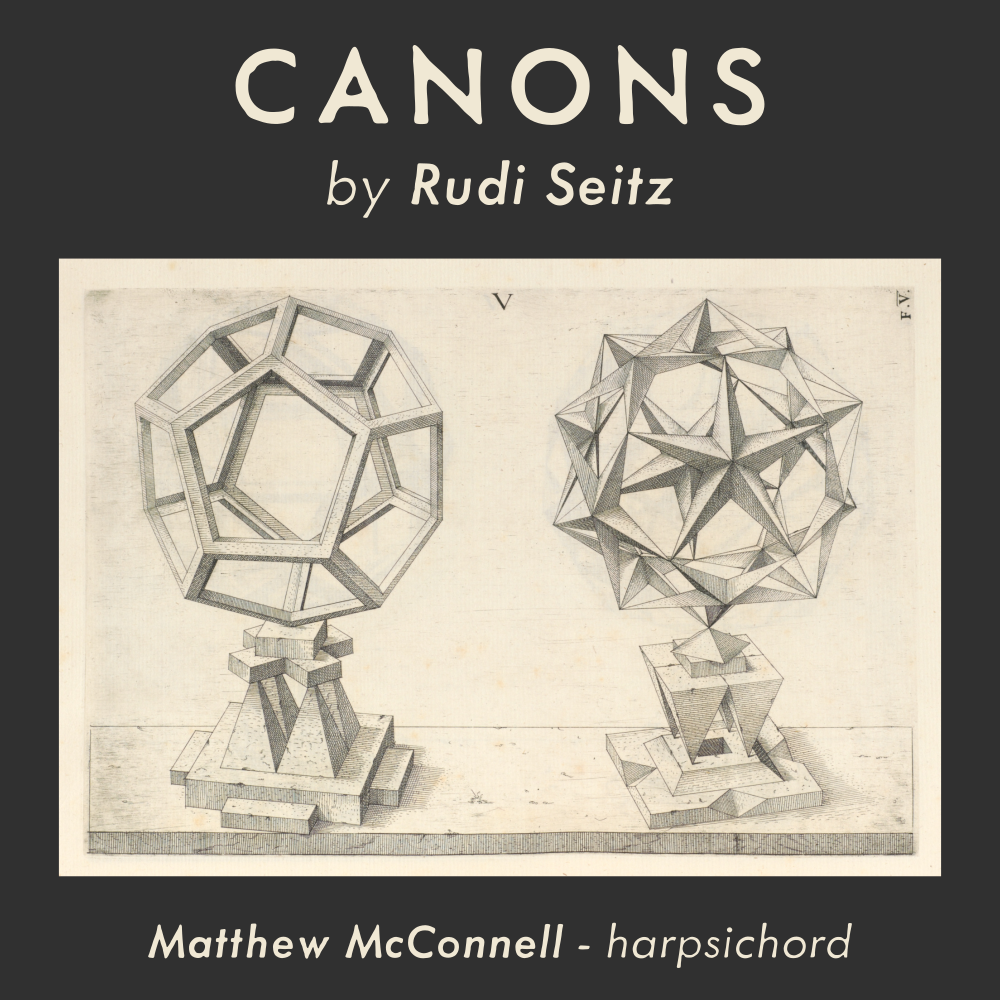
Jamnitzer was a famous goldsmith working in Nuremberg in the 16th century. His Perspectiva Corporum Regularium explores the way myriad forms can be created from the building blocks of the five Platonic solids. The work shows his remarkable ability to visualize complex geometric constructions and project them convincingly in two dimensions. I love the way he chose to balance his structures on intricate and seemingly precarious stands. He didn’t have to draw those elaborate stands, but he did, and doing it gives the images an element of whimsicality and improbability that really speaks to me. What we see here are possible structures (these are not like the impossible Penrose stairs we considered earlier), which could possibly be balanced the way they are… but only for a split second. If we are to treat this drawing as depiction of a real scene, we must be witnessing a fleeting moment while the structures were balanced on their stands before they promptly toppled off; else we are observing a more perfect, fantastical world where things just remain in balance
Why do I like this image as an album cover? It’s old, but yet timeless in the geometrical perfection of the objects shown, and almost modern in the surreality of their balancing act. It reminds me of the way the canons themselves are balancing acts, and how each canon seems to me, in some sense impossible, and yet somehow my process of creation has wrung them all into being, and Matt has recorded them so beautifully, and they’re available to witness!
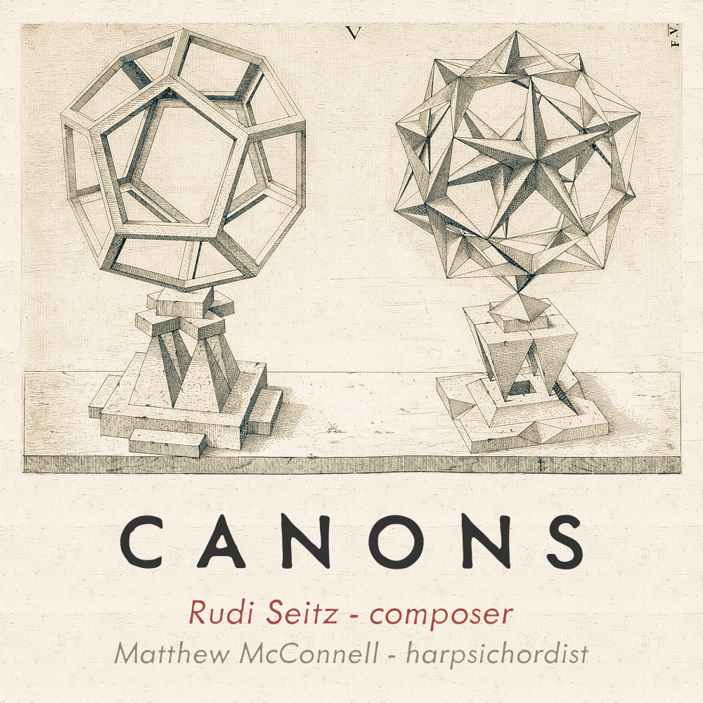
Only problem with this Jamnitzer cover is, my mom just told me she’s not crazy about it… likes it but finds it a little lackluster. I’ll keep my eyes open for other possibilities, but for now I’m treating this as “the one.”
Here’s an updated version (still in progress) incorporating some advice and guidance by my friend AG:
 ■
■